Nilfisk

Crafting a cutting-edge design system and UI for their new website!

©2024

Design system design Nilsk, new website

UI/UX Design Studio

Copenhagen

It was an enriching experience to develop the Nilfisk design system and establish their new responsive website. While the in-house department handled branding, I took charge of the rest. Nilfisk previously had a cluttered and inconsistent website. I now rectified it and laid the foundation for Nilfisk to be a prominent player in the digital market. Subsequently, the design system has been implemented across other Nilfisk products .

If you want to learn more about the process or want to bring another solution to life, feel free to contact Manna Studio

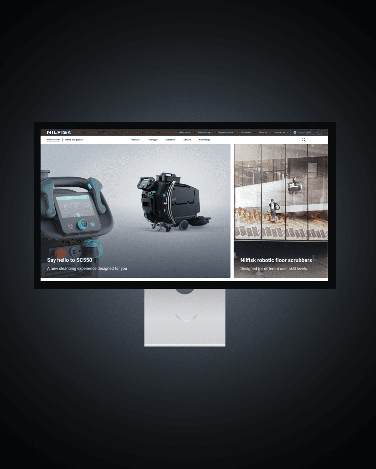
Frontpage Nilfisk, ipad, new website
Nilfisk new website UI design. Mobile
Block design Nilfisk UI design. new website

Figma
Work

Figma Work

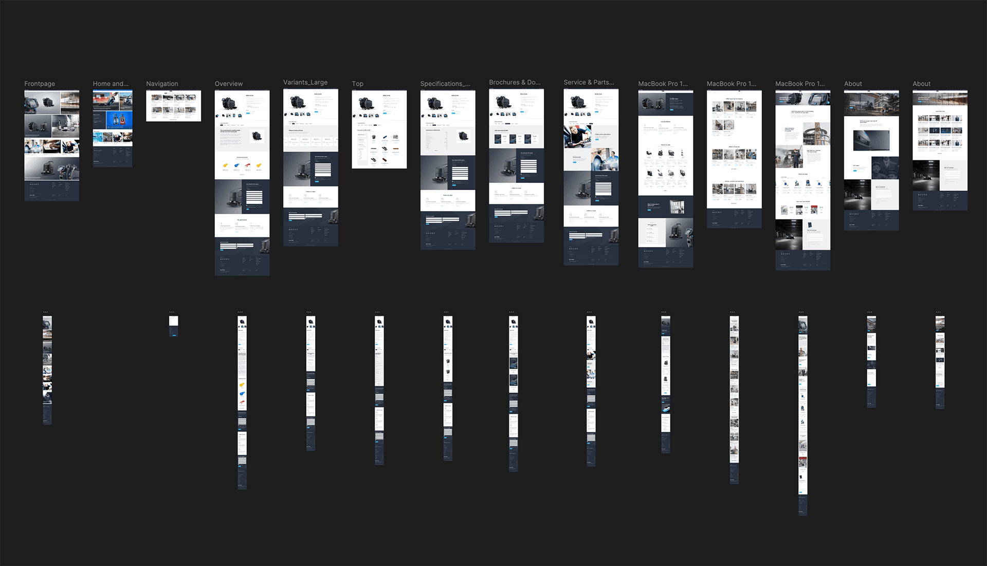
Gain complete control of the design process with a designsystem, ensuring consistency across the brand’s visual identity (CVI). Above you see a sneak peak of the designsystem made for Nilfisk

Block design Nilfisk UI design. new website

Examples of prototype designs created for the Nilfisk website. Mobile and desktop.

Colors used on Nilfisk new wenbsite
Roboto font used for Nilfisk new website
Colors used on Nilfisk new wenbsite

Design system

We deliever concept and design for digital solutions

Design system

We deliever concept and design for digital solutions

Design system

We deliever concept and design for digital solutions